
Botánica by Mojo & Muse, The Untold Journey to get to The Met
Every collection begins somewhere.
For Botánica, it began at The Met.
An Evening at The Met
An Evening at The Met was a collaborative effort between Royal Thai, BDL, Emser, Ferguson, Global Allies, HFC, Laticrete, Moen, Silhouette, Pkaufmann, and Wolf Gordon in November 2025.
Royal Thai was tasked with providing the red carpet for the event—Mojo & Muse x Royal Thai at the Met emerged.


Designing Beyond the Canvas
There is a distinct vulnerability in showing the pieces that didn't make it.
We are used to presenting the flawless final product—the gleaming rug under museum lights, the perfect layout in a glossy brochure. But standing in the halls of the Metropolitan Museum of Art for an exclusive industry party, surrounded by hundreds of peers, we realized something. The true magic of our latest collaboration, Botánica with Manoela Grigorova of Mojo & Muse, wasn’t just the final carpet on display. It was the beautiful failures, discarded poms, and samples left at the studio that actually got us there.
Here is what it actually takes to translate fine art into a high-performance hospitality reality.
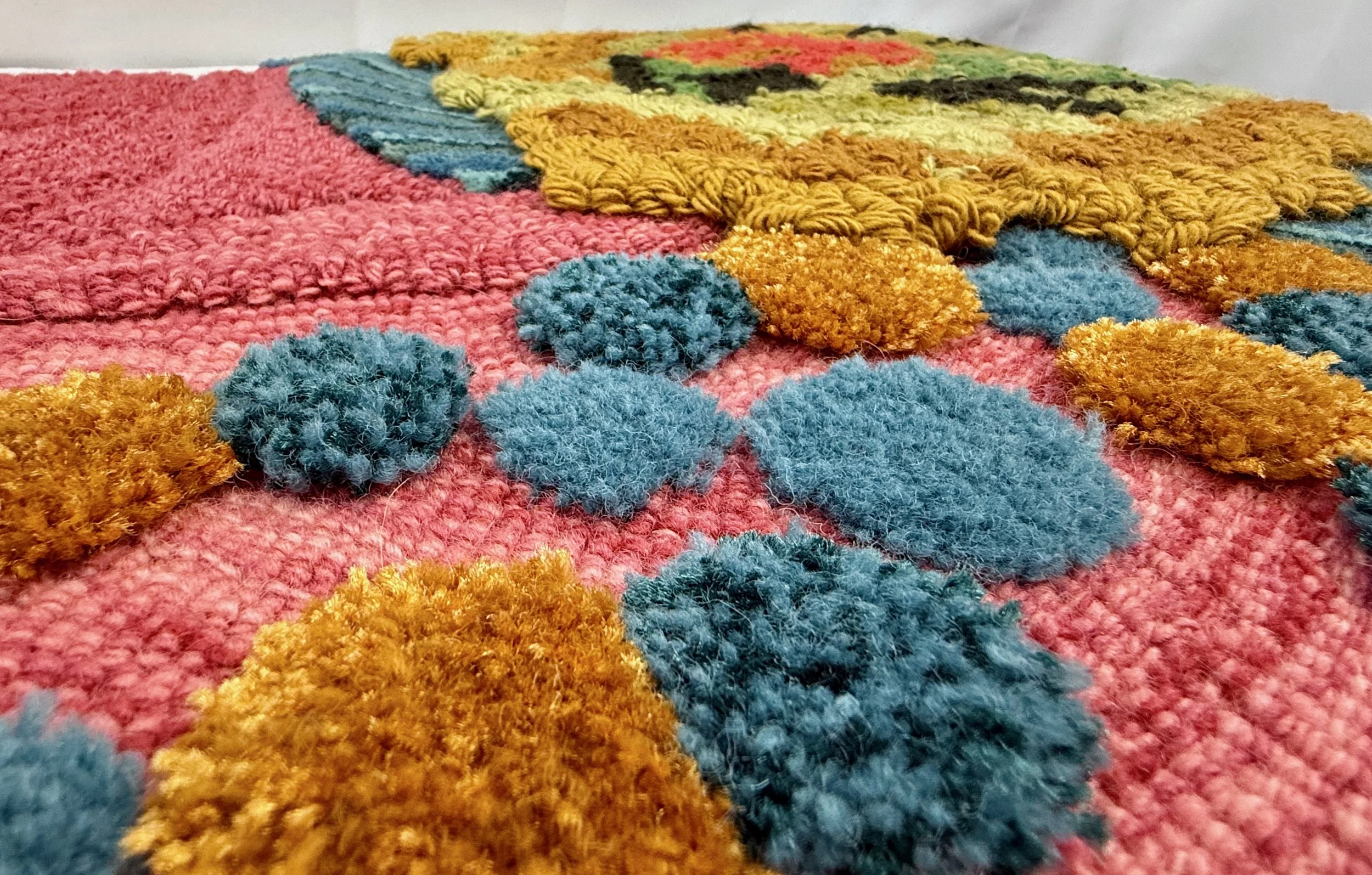
Pom Selection
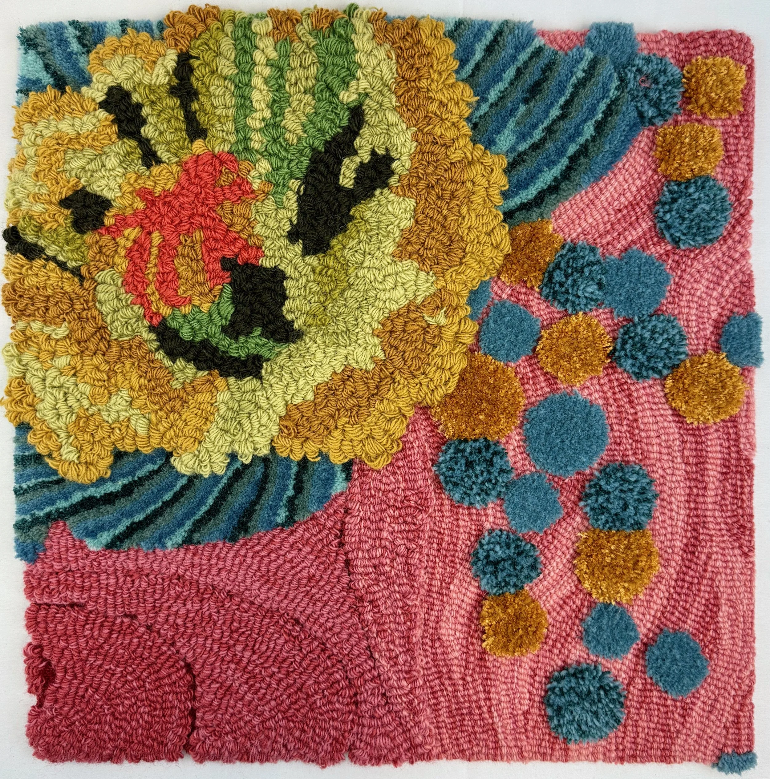
Every carpet in Botánica began its life as an alcohol ink painting. Manoela’s original artwork relies on the bleeding gradients of alcohol inks juxtaposed with tightly wound stitches, French knots, and glistening glass beads.
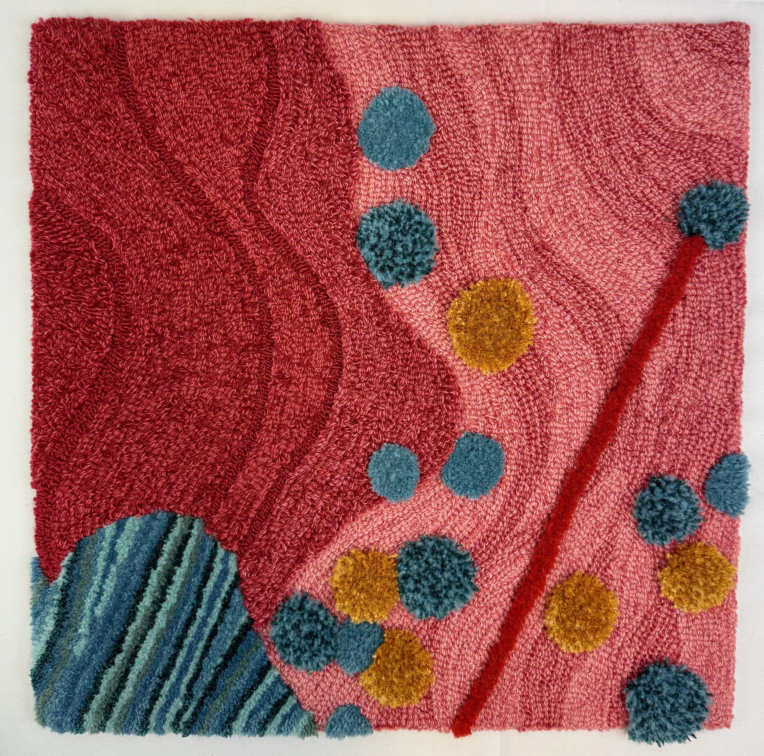
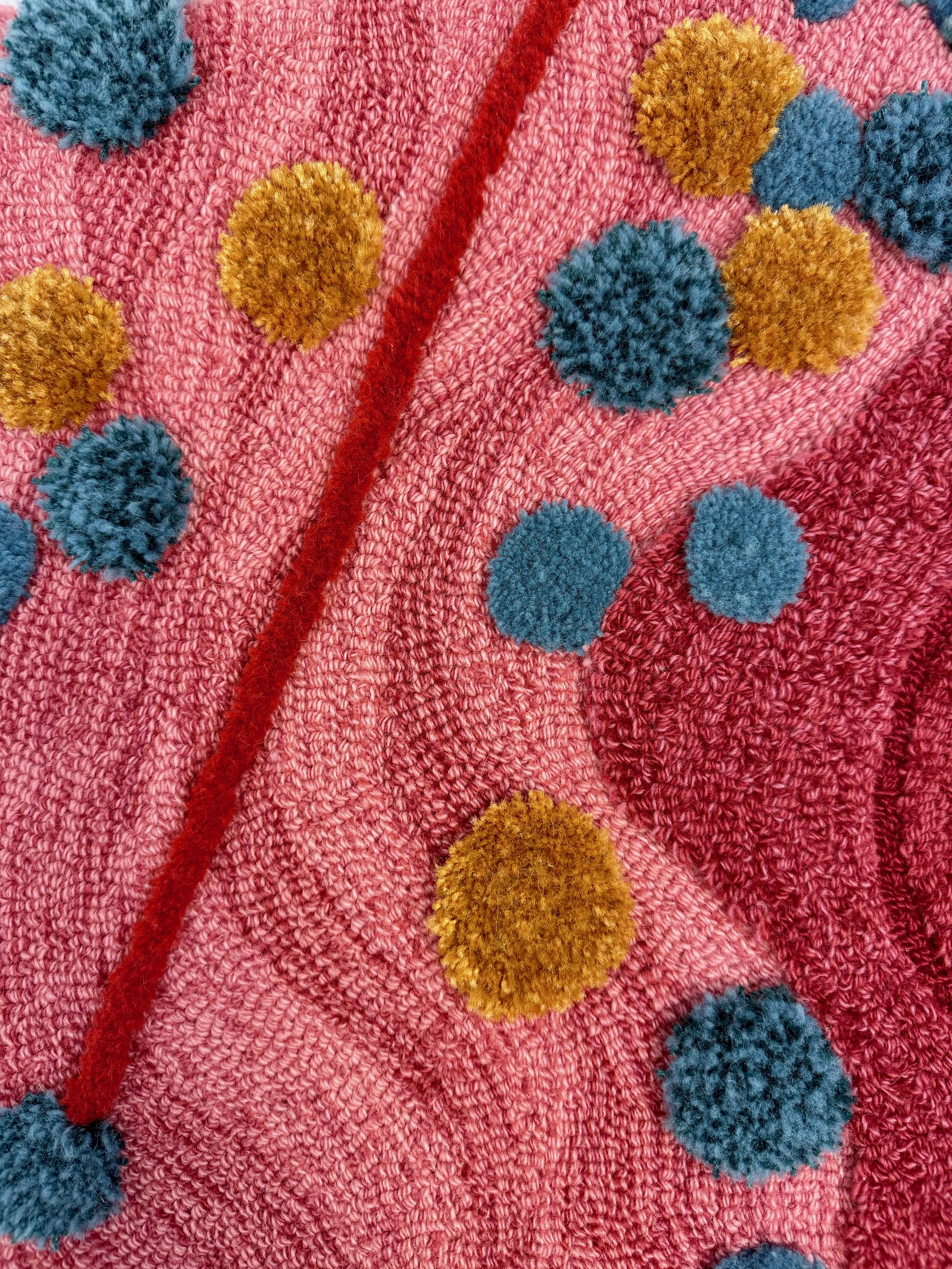
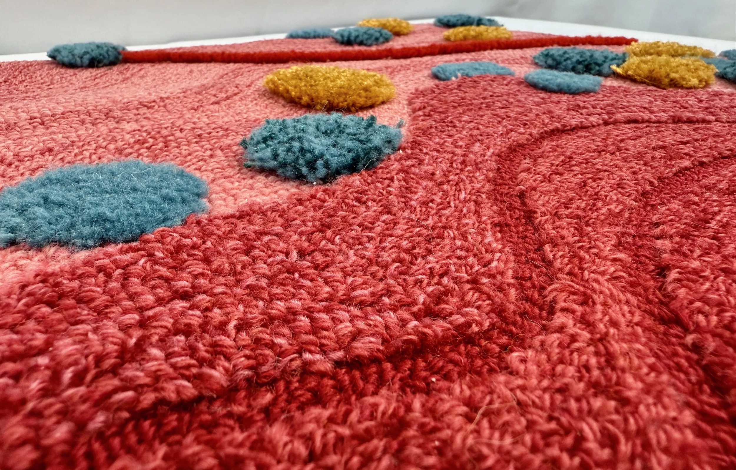
Our first challenge was translation—and for the Met, it required a unique strategic twist. We knew the specific carpet The Met event was meant to stand apart from the rest of the collection's color palette. Rather than matching the standard palette, we dove into our poms to curate a bespoke selection of deep reds, blush pinks, and dramatic crimson tones, specifically chosen to complement the party's visual theme.
But truth be told? We didn’t get it right the first time, or even the second. Our initial samples came back—they felt flat and lacked the artistic warmth of the original concept. We had to pivot, reassess our color choices, and resample. This is exactly why you sample; on paper or digitally, a color can make sense, but in reality, it can take that physical sample to find the perfect harmony that captures the final vision.
The Design Hurdles
Hand tufting gives us immense structural freedom, but hospitality design demands strict real-world performance. This is where our initial samples met the reality of public spaces.
You’ll see some of the original samples that were ultimately rejected.
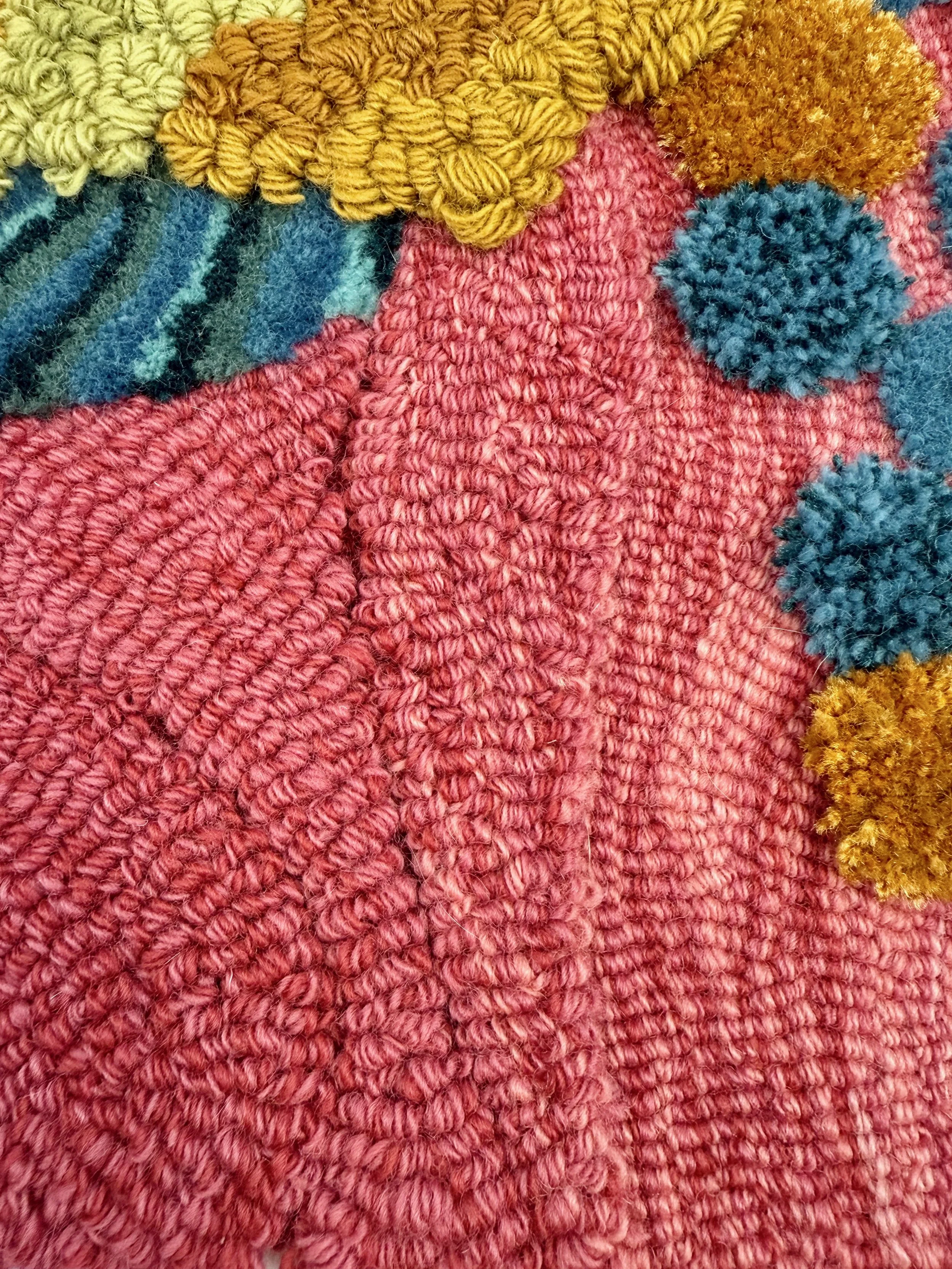
Look closely at the samples. Visually, this sample perfectly captured the raised, three-dimensional drama of Manoela's mixed-media embroidery. But underfoot? The decorative loops were tufted too high and left too loose in an attempt to mirror embroidery threads. In a commercial setting, these loose loops would instantly catch on a heel, creating a tripping hazard and destroying the carpet.
We had to iterate. Our designers back-stepped, adjusting the specifications and lowering the pile height, finding balance between the raised embroidery, the structural integrity and the safety of walking on the rug.
From Frame to Floor
Seeing the carpets on the frames reveals the extraordinary artistry behind this collection. Hand tufting is a highly specialized craft where every line, curve, and texture is guided directly by a master artisan's hand.
Ultimately, hand tufting is not a digital print; it is a living, breathing craft of trial, error, and immense discipline. It takes iterations to get it right. But when the perfect color harmony, the exact pile height, and the vision of an artist finally lock together, the result is something that transcends the floor beneath your feet.
We did that at The Met.
